A 2026 gift guide for the map lover
On September 4, the UN General Assembly voted 164 to 1 to encourage governments to use the Equal Earth projection, which shows Africa at its real size relative to Greenland: 14 times larger. The United States cast the one no vote, and the resolution doesn't ban the Mercator projection. This list is for the people who have an opinion about that vote.
Pick the items you want with "Add to wishlist," or take the whole list with the button at the bottom:
- The Equal Earth physical map, printed full sizeThe file is free. It needs a print shop
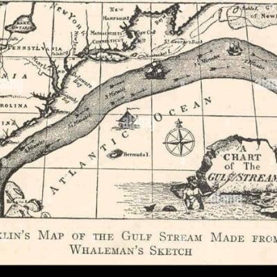 A framed print of Franklin's Gulf Stream chartFramed
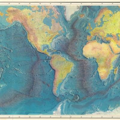 An original 1977 World Ocean Floor map by Heezen and TharpNot the magazine insert$1,800
- A NOAA custom chart of the coast where we spend summers
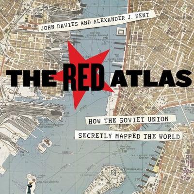 The Red Atlas by John Davies and Alexander J. Kent
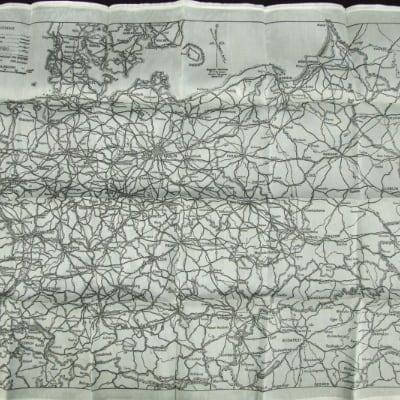 An original WWII silk escape mapAny region. Must be the real thing
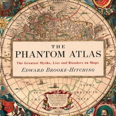 The Phantom Atlas by Edward Brooke-Hitching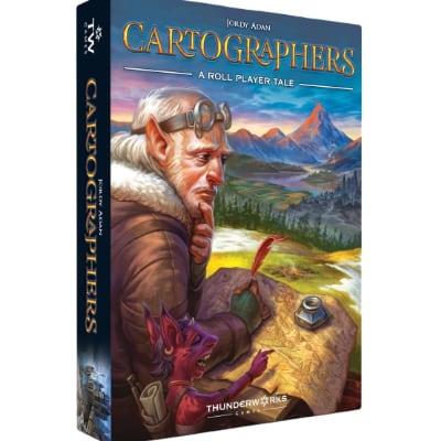
As an Amazon Associate, WishPoster earns from qualifying purchases.
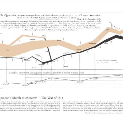
Napoleon's march
Charles Joseph Minard was a French civil engineer who drew 51 thematic maps. The one he drew in 1869 follows Napoleon's army into Russia in 1812 and back out again, and it shows six kinds of data at once: the size of the army, distance, temperature, latitude and longitude, direction of travel, and dates. The band is one millimeter wide for every 10,000 men, so you can watch it thin out on the way to Moscow and nearly vanish on the black retreat line, which runs above a chart of the falling winter temperatures. Edward Tufte said it "may well be the best statistical graphic ever drawn." There's also a version with an English translation printed next to the French original.
Three ways to flatten the globe
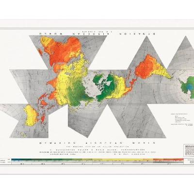
Buckminster Fuller's way to flatten the Earth was to project it onto a solid with flat faces and then unfold it. The first version appeared in Life magazine on March 1, 1943, and the 1954 version he made with Shoji Sadao uses an icosahedron, with the cuts placed in the oceans so the continents come out as nearly one landmass. Fuller argued there's no real up or down in space, so the map has no right way up. Proceeds from the poster go to the Buckminster Fuller Institute's programs.
The Peters projection is an equal-area map that the Scottish clergyman James Gall described in 1855 and Arno Peters presented as his own in 1973. Cartographers objected to his claims that it was the only "area-correct" map and to its stretched shapes near the equator. In 2001 an episode of The West Wing had a group of cartographers pitching it to the White House staff, and ODT, its North American publisher, said the broadcast "transformed our business". Boston Public Schools bought 600 of the maps in 2017.
That Boston decision is where Equal Earth came from. Bojan Šavrič, Bernhard Jenny and Tom Patterson looked for an equal-area projection that looked better than Peters, didn't find one, and designed Equal Earth in 2018. Patterson then made a wall-sized physical map in the projection, 55 by 30.3 inches at 350 dpi, and put it in the public domain. It shows terrain, rivers, vegetation and the ocean floor.
The Gulf Stream and the ocean floor
In 1768, Benjamin Franklin was deputy postmaster general for the colonies and wanted to know why the British mail packets were so slow crossing the Atlantic. He asked his cousin Timothy Folger, a Nantucket captain. Folger said the packets were sailing against the Gulf Stream, which whalers knew well, and drew it on a chart. Franklin had it engraved, and it became the first published chart of the Gulf Stream.
Marie Tharp drew the ocean floor without being allowed on the ships. Women were barred from the research vessels, so she worked from the depth soundings Bruce Heezen collected at sea, and she found the rift valley running down the middle of the Mid-Atlantic Ridge, which helped get plate tectonics accepted. Heezen at first dismissed it as "girl talk." Their 1977 World Ocean Floor map was painted by the Austrian landscape artist Heinrich Berann, and Heezen died the year it was issued. Neatline Maps has an original from 1977, which is scarcer than the version National Geographic republished. In 1997 the Library of Congress named Tharp one of the four greatest cartographers of the 20th century.
NOAA has an online tool for making your own nautical chart from its current electronic chart data, centered and scaled however you like. You download it as a PDF, and OceanGrafix, an official NOAA chart printer, prints it.
War maps
The Soviet military spent decades making hundreds of thousands of maps of the whole world, with notes on things like what a bridge was built from and how much weight it could carry. A 1980 Soviet map of San Diego shows the Naval Training Center and the Marine Corps Recruit Depot in more detail than the 1979 USGS map of the same area. The maps were never declassified. They started turning up in map dealers' catalogs as the Soviet Union broke up, and John Davies spent more than a decade studying them before writing The Red Atlas with the geographer Alexander Kent.
In World War II, the British escape and evasion unit MI9 had Waddingtons, the Leeds company that made Monopoly, print maps on silk. Silk didn't tear, didn't dissolve in water and didn't rustle when a prisoner moved it, and it could be crumpled into a small space. Waddingtons hid them inside Monopoly boards sent to prisoner of war camps, along with compasses, files and real money. Most of the American versions were actually rayon acetate, called silk for its feel.
Maps that were wrong
The Phantom Atlas is a book of old maps of places that don't exist. Sandy Island was recorded by a whaling ship in the Coral Sea in 1876 and wasn't declared fictional until November 2012. California shows up as an island on many 17th-century maps, and Mercator put a huge magnetic black rock at the North Pole.
Maps you can touch
Raised relief maps are printed flat on vinyl and then vacuum formed over a terrain model built from USGS elevation data. The Map Shop in Charlotte took over making Hubbard Scientific's maps in 2020.
In Cartographers, a flip-and-write game from 2019 by Jordy Adan, each player draws terrain onto their own map as cards are flipped, scoring against goals that change every game over four seasons. It was nominated for the Kennerspiel des Jahres.
Globes
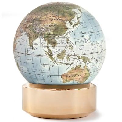
Peter Bellerby started Bellerby & Co in London in 2008 after he couldn't find a good globe to give his father for his 80th birthday. A globe map is printed as a set of pointed strips called gores, and Bellerby's makers dampen and stretch each one onto the sphere by hand without a wrinkle. Bellerby says training a new globemaker takes about a year.
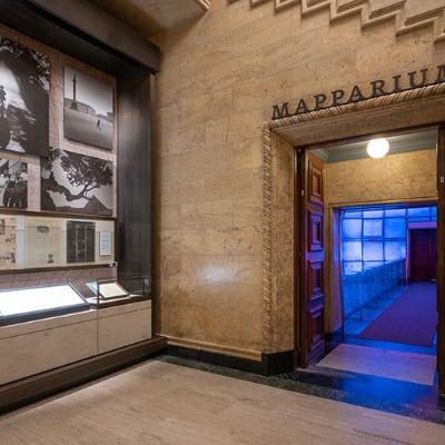
The Mapparium in Boston is a globe you stand inside. It was built in 1935 from 608 stained glass panels, with a 30-foot bridge through the middle, and the borders come from 1934 Rand McNally maps, so it still shows the world before World War II. From the center your eye is the same distance from every point on the surface, which makes it a map of the world without projection distortion. It's also a whispering gallery: a whisper on one side carries to the other.
The Leventhal Map & Education Center at the Boston Public Library in Copley Square has about 250,000 maps, from the 15th century to now, and puts on free exhibitions. A new exhibition opens there on October 30.
In conclusion
The list above copies straight into a new WishPoster list with the Nautical theme. Or start one from scratch.
Ready to make your own wishlist?